Planned

Visualize data within graphs in Analytics

Related products:Analytics

Marcos

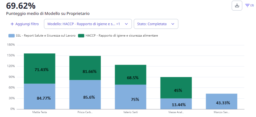
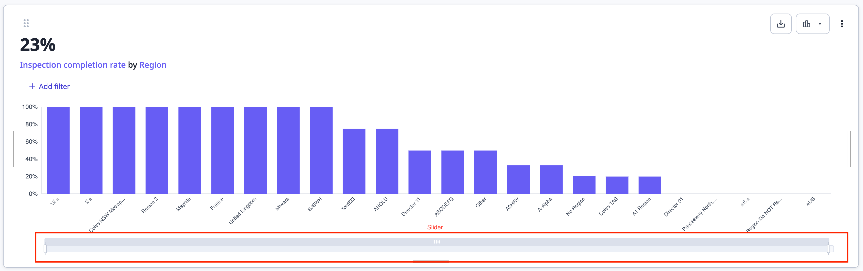
You can visualize the specific data and numbers only by hovering with the mouse.

Would be useful having all the data and numbers already within the graphs. 

Also for png/jpg download, so that in presentations all the data is more understandable. 

11 replies

Manan
SafetyCulture Crew
Forum|alt.badge.img
  • SafetyCulture Crew
  • 23 replies
  • April 19, 2024

Hey @Marcos, thanks for sharing this feedback.


I’d like to learn more here, just for my own understanding - are you referring to the below wherein you can see more details when you hover over a particular segment?


We’re also enhancing our JPEG/PNG download functionalities, in which you’ll see more metadata about the chart and it’s contents than before. We’re looking to include the below in our image exports - 

  1. Title of the chart
  2. Total (the number at the top left)
  3. Legends about individual segments (if needed)
  4. The chart itself (the portion of the chart that is in view when you click on both the Download > Chart image options.


Mattia T.
  • Starter
  • 2 replies
  • April 22, 2024

Hi Manan,
it would be really helpful if all the percentages of individual columns were shown in the graph without the need to hoover the mouse over them.
Also, it would be helpful to be able to resize the text: if the names on the axis are too long (which happens often with sites names) they are not shown correctly.
As I understand it, the function of exporting the graph to png or jpeg is simply a screenshot of the graph as it is shown on the screen, so if there is too much data in the graph it will not be fully displayed (the generated image will contain only the data visible at the time of the screenshot). It would be useful if all the data were always exported so that it could be more easily embedded into a document or presentation; as it is now, it’s currently unusable for this purpose.


Manan
SafetyCulture Crew
Forum|alt.badge.img
  • SafetyCulture Crew
  • 23 replies
  • April 23, 2024
Mattia T. wrote:

Hi Manan,
it would be really helpful if all the percentages of individual columns were shown in the graph without the need to hoover the mouse over them.
Also, it would be helpful to be able to resize the text: if the names on the axis are too long (which happens often with sites names) they are not shown correctly.

Hey @Mattia T. , thanks for the context. We’re working on adding the capability to vertically resize the chart, this will allow more real estate for data and labels associated with the data points.


Appreciate the feedback, it’s detailed and very helpful for our product & engineering teams.


Marcos
Forum|alt.badge.img+1
  • Author
  • Speaker
  • 12 replies
  • April 23, 2024

Hi @Manan

Thanks for the reply! 
I confirm what Mattia mentioned.
As example, something like that:
 

So that main results are visible as default, then hovering more deep data is shown.

Thanks for your work.

Marcos


Bianca.Taylor
Forum|alt.badge.img
  • Former SafetyCulture Crew
  • 553 replies
  • July 5, 2024
NewDiscussion ongoing

Corey
Forum|alt.badge.img+6
  • Speaker
  • 260 replies
  • July 16, 2024

I’m trying to like and start using the “New Analytics” but it is still early in development and not ready for prime use. Examples, much of which was mentioned above:

  1. Functionality
    1. Cannot select multiple questions from a template to show their responses each in a separate column in a table format (limited to 1)
    2. Cannot select multiple questions from a template to show either breakdown or stacked bar charts (such as for question 1 choice A, these choices of question 2 were selected, and for question one Choice B, these choices of question 2 were selected)
  2. Charts
    1. Column and Bar Charts do not show the values (would be fine even if it was only the larger bars) directly on the chart and require hovering; preferably this would be a toggle you can save in the dashboard per chart but the user can switch it on off at will in case they don’t want them.
    2. Column Charts X-axis label area is very short and are ALWAYS cut off after a few characters; the chart area should resize vertically to fit them and either wrap or change the font size as needed.
    3. Bar Charts Y-axis label area, while better than column charts, still cuts off labels, sometimes both on the left and right side.
    4. If you vertically resize a chart, it only resizes the actual chart portion a limited amount, then the remainder of your resizing ends up as white space; at a specific height, it stops you from being able to pull it down even taller (which is probably tall enough if it actually expanded the chart to that whole frame); it also does not expand the area given to the x-axis labels when you make it taller.
    5. When downloading the chart image (which is a great feature), it does not include the chart title, attributes, and features; you have to type that wherever you choose to use/share the image. If toggle for value on bars is added per #1, it should follow that to include/exclude them.

david-wong-sc
SafetyCulture Crew
  • SafetyCulture Crew
  • 3 replies
  • July 18, 2024
Mattia T. wrote:

Hi Manan,
it would be really helpful if all the percentages of individual columns were shown in the graph without the need to hoover the mouse over them.
Also, it would be helpful to be able to resize the text: if the names on the axis are too long (which happens often with sites names) they are not shown correctly.
As I understand it, the function of exporting the graph to png or jpeg is simply a screenshot of the graph as it is shown on the screen, so if there is too much data in the graph it will not be fully displayed (the generated image will contain only the data visible at the time of the screenshot). It would be useful if all the data were always exported so that it could be more easily embedded into a document or presentation; as it is now, it’s currently unusable for this purpose.

Hi @Mattia T.,

You are correct in that the function of exporting graphs to images is a screen-grab of the chart displayed on the screen - with some additional tweaking behind the scenes. 

For large datasets, each chart should contain a slider that allows you to include all of the data into the view. The exported screenshot would then have everything. 


David


david-wong-sc
SafetyCulture Crew
  • SafetyCulture Crew
  • 3 replies
  • July 18, 2024
Corey wrote:

I’m trying to like and start using the “New Analytics” but it is still early in development and not ready for prime use. Examples, much of which was mentioned above:

  1. Functionality
    1. Cannot select multiple questions from a template to show their responses each in a separate column in a table format (limited to 1)
    2. Cannot select multiple questions from a template to show either breakdown or stacked bar charts (such as for question 1 choice A, these choices of question 2 were selected, and for question one Choice B, these choices of question 2 were selected)
  2. Charts
    1. Column and Bar Charts do not show the values (would be fine even if it was only the larger bars) directly on the chart and require hovering; preferably this would be a toggle you can save in the dashboard per chart but the user can switch it on off at will in case they don’t want them.
    2. Column Charts X-axis label area is very short and are ALWAYS cut off after a few characters; the chart area should resize vertically to fit them and either wrap or change the font size as needed.
    3. Bar Charts Y-axis label area, while better than column charts, still cuts off labels, sometimes both on the left and right side.
    4. If you vertically resize a chart, it only resizes the actual chart portion a limited amount, then the remainder of your resizing ends up as white space; at a specific height, it stops you from being able to pull it down even taller (which is probably tall enough if it actually expanded the chart to that whole frame); it also does not expand the area given to the x-axis labels when you make it taller.
    5. When downloading the chart image (which is a great feature), it does not include the chart title, attributes, and features; you have to type that wherever you choose to use/share the image. If toggle for value on bars is added per #1, it should follow that to include/exclude them.

Hi @Corey , 

Thank you for the insightful feedback. 

Re: 2.1
Displaying value labels within charts is straightforward to implement but may appear cluttered or unintended on small bars or charts with a large number of bars. I love the idea of being able to toggle value labels on and off. 

Re: 2.2 & 2.3
Axis labels can become truncated due to their length, leading to a trailing appearance. To enhance readability, we want to consider displaying the full label in a tooltip on hover and turning on word wrap in images. 

I’ll collate these discussions into notes for the engineering team. 

Thanks, 
David 


Corey
Forum|alt.badge.img+6
  • Speaker
  • 260 replies
  • July 18, 2024

Thanks, @david-wong-sc 


Regarding the bar value labels, I’m not sure how easily you can implement this, but perhaps any bars that are too short to fit the label you just don’t put the label on them.  In other words, only label the larger (more significant) bars.

We’ve had a lot of chatter about using data in SC within our company.  While we have developed a nice Power BI dashboard, it would be better to have most of the data consumption native to the platform so dashboards can be made on the fly for routine trending but also on the fly needs.  The old Analytics had a lot of power but could be overwhelming.  I’m hoping the new version will evolve to make it a true alternative to Power BI.


david-wong-sc
SafetyCulture Crew
  • SafetyCulture Crew
  • 3 replies
  • July 19, 2024
Corey wrote:

Thanks, @david-wong-sc 


Regarding the bar value labels, I’m not sure how easily you can implement this, but perhaps any bars that are too short to fit the label you just don’t put the label on them.  In other words, only label the larger (more significant) bars.

We’ve had a lot of chatter about using data in SC within our company.  While we have developed a nice Power BI dashboard, it would be better to have most of the data consumption native to the platform so dashboards can be made on the fly for routine trending but also on the fly needs.  The old Analytics had a lot of power but could be overwhelming.  I’m hoping the new version will evolve to make it a true alternative to Power BI.

That’s a fantastic suggestion. I’ll add that as an additional exploratory option to only label significant bars. 

One of my aspirations is to replace Power BI with our analytics tool but I acknowledge that we may still have a ways to go. At least, I hope that in time it would become complementary to our client’s usage of Power BI. 

David


Bianca.Taylor
Forum|alt.badge.img
  • Former SafetyCulture Crew
  • 553 replies
  • August 22, 2024
Under considerationPlanned feature

Reply


Cookie policy

We use cookies to enhance and personalize your experience. If you accept you agree to our full cookie policy. Learn more about our cookies.

 
Cookie settings